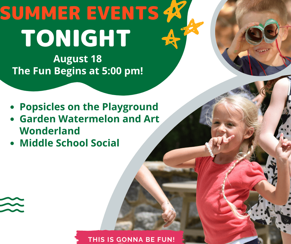
We hope to see you tonight!
We hope to see you tonight! body,#bodyTable,#bodyCell{ height:100% !important; margin:0; padding:0; width:100% !important; } table{ border-collapse:collapse; } img,a img{ border:0; outline:none; text-decoration:none; } h1,h2,h3,h4,h5,h6{ margin:0;...
} @media only screen and (max-width: 480px){ body{ width:100% !important; min-width:100% !important; }
} @media only screen and (max-width: 480px){ .mcnRetinaImage{ max-width:100% !important; }
} @media only screen and (max-width: 480px){ td[id=bodyCell]{ padding:10px !important; }
} @media only screen and (max-width: 480px){ table[class=mcnTextContentContainer]{ width:100% !important; }
} @media only screen and (max-width: 480px){ .mcnBoxedTextContentContainer{ max-width:100% !important; min-width:100% !important; width:100% !important; }
} @media only screen and (max-width: 480px){ table[class=mcpreview-image-uploader]{ width:100% !important; display:none !important; }
} @media only screen and (max-width: 480px){ img[class=mcnImage]{ width:100% !important; }
} @media only screen and (max-width: 480px){ table[class=mcnImageGroupContentContainer]{ width:100% !important; }
} @media only screen and (max-width: 480px){ td[class=mcnImageGroupContent]{ padding:9px !important; }
} @media only screen and (max-width: 480px){ td[class=mcnImageGroupBlockInner]{ padding-bottom:0 !important; padding-top:0 !important; }
} @media only screen and (max-width: 480px){ tbody[class=mcnImageGroupBlockOuter]{ padding-bottom:9px !important; padding-top:9px !important; }
} @media only screen and (max-width: 480px){ table[class=mcnCaptionTopContent],table[class=mcnCaptionBottomContent]{ width:100% !important; }
} @media only screen and (max-width: 480px){ table[class=mcnCaptionLeftTextContentContainer],table[class=mcnCaptionRightTextContentContainer],table[class=mcnCaptionLeftImageContentContainer],table[class=mcnCaptionRightImageContentContainer],table[class=mcnImageCardLeftTextContentContainer],table[class=mcnImageCardRightTextContentContainer],.mcnImageCardLeftImageContentContainer,.mcnImageCardRightImageContentContainer{ width:100% !important; }
} @media only screen and (max-width: 480px){ td[class=mcnImageCardLeftImageContent],td[class=mcnImageCardRightImageContent]{ padding-right:18px !important; padding-left:18px !important; padding-bottom:0 !important; }
} @media only screen and (max-width: 480px){ td[class=mcnImageCardBottomImageContent]{ padding-bottom:9px !important; }
} @media only screen and (max-width: 480px){ td[class=mcnImageCardTopImageContent]{ padding-top:18px !important; }
} @media only screen and (max-width: 480px){ table[class=mcnCaptionLeftContentOuter] td[class=mcnTextContent],table[class=mcnCaptionRightContentOuter] td[class=mcnTextContent]{ padding-top:9px !important; }
} @media only screen and (max-width: 480px){ td[class=mcnCaptionBlockInner] table[class=mcnCaptionTopContent]:last-child td[class=mcnTextContent],.mcnImageCardTopImageContent,.mcnCaptionBottomContent:last-child .mcnCaptionBottomImageContent{ padding-top:18px !important; }
} @media only screen and (max-width: 480px){ td[class=mcnBoxedTextContentColumn]{ padding-left:18px !important; padding-right:18px !important; }
} @media only screen and (max-width: 480px){ td[class=sectionContainer]{ display:block !important; max-width:600px !important; width:100% !important; }
} @media only screen and (max-width: 480px){ td[class=mcnTextContent]{ padding-right:18px !important; padding-left:18px !important; }
} @media only screen and (max-width: 480px){ table[id=templateContainer],table[id=templatePreheader],table[id=templateHeader],table[id=templateBody],table[id=templateBodyInner],table[id=templateSidebar],table[id=templateSidebarInner],table[id=templateFooter]{ max-width:600px !important; width:100% !important; }
} @media only screen and (max-width: 480px){ h1{ font-size:24px !important; line-height:125% !important; }
} @media only screen and (max-width: 480px){ h2{ font-size:20px !important; line-height:125% !important; }
} @media only screen and (max-width: 480px){ h3{ font-size:18px !important; line-height:125% !important; }
} @media only screen and (max-width: 480px){ h4{ font-size:16px !important; line-height:125% !important; }
} @media only screen and (max-width: 480px){ table[class=mcnBoxedTextContentContainer] td[class=mcnTextContent],td[class=mcnBoxedTextContentContainer] td[class=mcnTextContent] p{ font-size:18px !important; line-height:125% !important; }
} @media only screen and (max-width: 480px){ table[id=templatePreheader]{ display:block !important; }
} @media only screen and (max-width: 480px){ td[class=preheaderContainer] td[class=mcnTextContent],td[class=preheaderContainer] td[class=mcnTextContent] p{ font-size:14px !important; line-height:115% !important; }
} @media only screen and (max-width: 480px){ td[class=headerContainer] td[class=mcnTextContent],td[class=headerContainer] td[class=mcnTextContent] p{ font-size:18px !important; line-height:125% !important; }
} @media only screen and (max-width: 480px){ td[class=sidebarContainer] td[class=mcnTextContent],td[class=sidebarContainer] td[class=mcnTextContent] p{ font-size:18px !important; line-height:125% !important; }
} @media only screen and (max-width: 480px){ table[id=templateSidebar]{ border-left:0 !important; border-right:0 !important; }
} @media only screen and (max-width: 480px){ table[id=templateSidebarInner]{ border-left:0 !important; border-right:0 !important; }
} @media only screen and (max-width: 480px){ td[class=bodyContainer] td[class=mcnTextContent],td[class=bodyContainer] td[class=mcnTextContent] p{ font-size:18px !important; line-height:125% !important; }
} @media only screen and (max-width: 480px){ td[class=footerContainer] td[class=mcnTextContent],td[class=footerContainer] td[class=mcnTextContent] p{ font-size:14px !important; line-height:115% !important; }
} @media only screen and (max-width: 480px){ td[class=footerContainer] a[class=utilityLink]{ display:block !important; }
}
|




|
More from 'Blazer News to Know.
More than a school.
A story worth following.
Schedule a tour at 135 Woodlawn School Loop, Mooresville, NC. Serving Davidson, Cornelius, Huntersville, and Lake Norman.